
Table of Contents
1.5 degrees. You've heard it. You've seen it on slides, in headlines, on protest signs. And if you're honest, it means almost nothing to you anymore. It's wallpaper. It's the background hum of a crisis that somehow still feels theoretical, even as the Great Barrier Reef bleaches for the fifth time and your students ask why the creek behind the school smells different this year.
The scientists know this. They've known it for a while. And some of them have finally stopped pretending that another peer-reviewed paper is going to fix the problem.
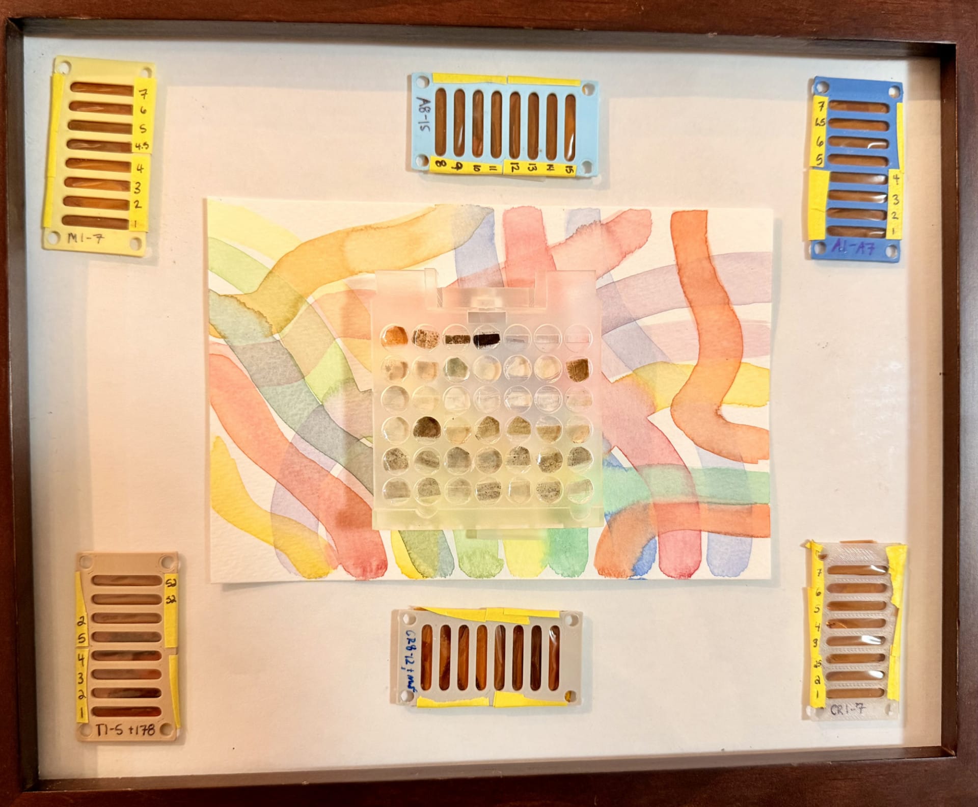
At Columbia University's Lamont-Doherty Earth Observatory, a geochemist named Ally Peccia is cradling a 3D-printed box of Pacific Ocean sediment like it's a newborn. Each grain is 65 million years old. She calls them witnesses. Not samples. Witnesses. "My attachment to them remains steadfast," she says, and you can hear that she means it in a way that would make most lab supervisors uncomfortable.
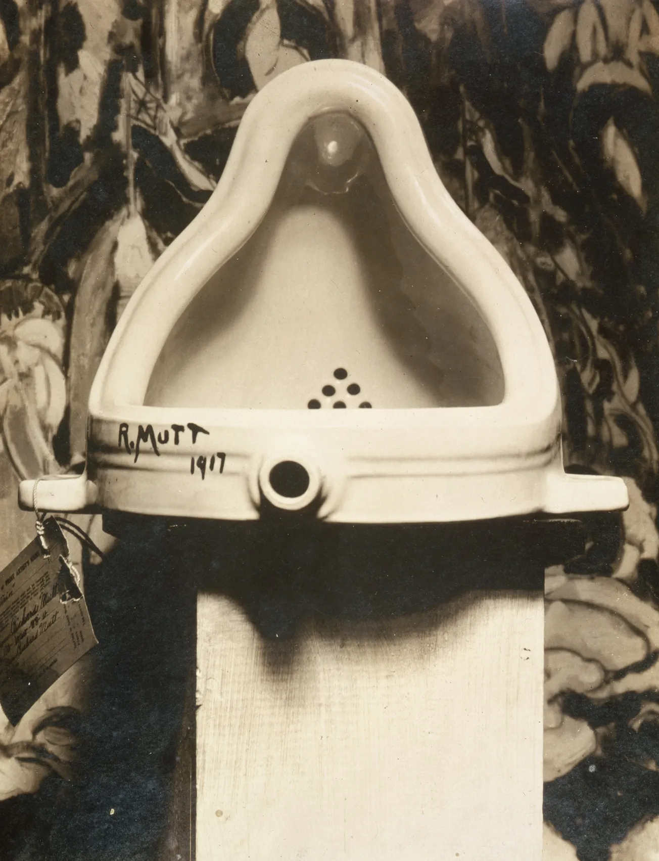
Peccia is part of Research as Art, an annual exhibition where climate scientists stop being climate scientists for a moment and become something harder to categorise. They make things. Sculptures from x-ray tape tubes. Coral cross-sections mounted like portraits. Climate data rendered as colour gradients that shift from cool blue to a red so aggressive it looks like the chart is bleeding.
None of this is decorative. It's a confession. A collective admission that decades of graphs, models, and carefully hedged abstracts have failed to make people feel what the data already proves.
Let's be blunt about why this matters for teachers. If you're an art teacher, you've spent your career defending your subject against people who think it's finger-painting and feelings. If you're a science teacher, you've watched students' eyes glaze over the moment you open a spreadsheet. And if you're both, or neither, or somewhere in the messy middle of cross-curricular teaching, you already know that the gap between information and understanding is where most education goes to die.
Columbia's exhibition isn't subtle about this. Mukund Rao photographed the same patch of forest every week for a year. Same angle, same tree, same frame. What you get isn't data. It's a gut punch. You watch a living system breathe through seasons, and then you notice the timing is wrong. The leaves are late. The snow is early. Something is off, and your body registers it before your brain catches up. That's what a temperature anomaly graph can't do.
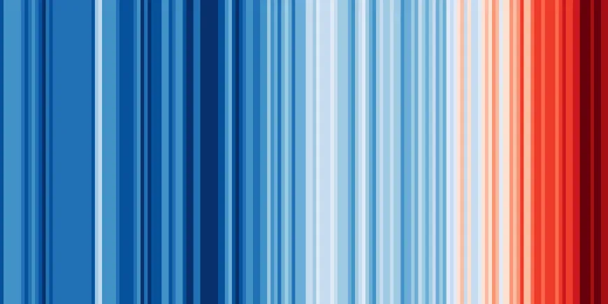
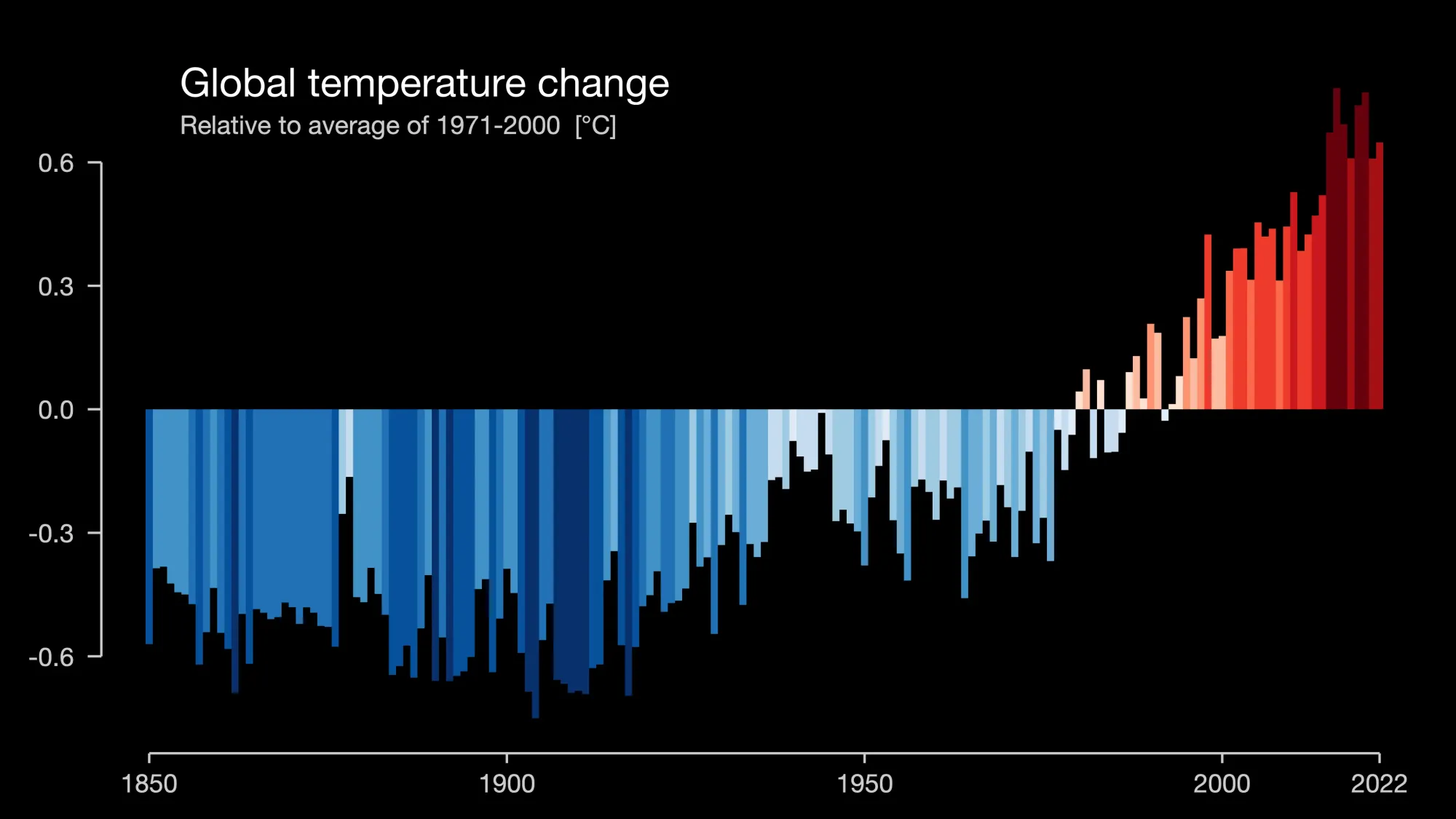
The climate stripe visualisations are even more direct. Interns from the Polar Climate Ambassador Programme took temperature records and turned them into bands of colour. The older bands are blue. The recent ones are red. There's no axis, no legend, no footnote. Just colour telling a story that your eyes understand instantly. It's the kind of thing a year 8 student could make in an afternoon, and it would teach them more about trend analysis than a month of textbook exercises.
"You have the intellect and the heart represented together," says Kate Doyle, a visual artist who did a residency at NASA's Goddard Institute. She calls what she makes "emotional data." Which sounds like marketing speak until you stand in front of one of her pieces and realise you're angry about ocean temperatures in a way you never were when they were just numbers in a table.
This is the part where most articles about STEAM education start listing "practical strategies for the classroom" in neat bullet points. Here's why that impulse is part of the problem.
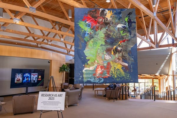
The whole point of what Columbia is doing is that you can't reduce this to a lesson plan template. A paint pour isn't a "creative assessment alternative." It's a group of people responding to each other in real time, making decisions without enough information, watching something emerge that none of them planned. Which, if you think about it, is a better model for how climate adaptation actually works than anything in a curriculum document.
The exhibition's most provocative move is also its simplest. They let 4,000 people walk through during open house events. Not scientists. Not art lovers. Neighbours. Kids. People who would never open a journal article. And those people spend hours in the space. They touch the sediment samples. They photograph the climate stripes for Instagram. They have conversations about ocean chemistry in a hallway, unprompted, because something on the wall made them curious enough to ask.
That's not outreach. That's what communication looks like when you stop assuming your audience is stupid and start assuming they're busy, overwhelmed, and starving for something that connects.
For teachers in Australia, where climate education is simultaneously mandated and politically contested, this approach solves a problem that nobody talks about openly. You can't teach climate urgency through neutrality. A balancedpresentation of "both sides" of atmospheric physics is not education; it's cowardice dressed up as fairness. But you also can't lecture teenagers into caring. They can smell a sermon from three classrooms away.
Art sidesteps the whole trap. A student who makes a sculpture from bleached coral fragments isn't being told what to think. They're handling the evidence. They're making choices about form, colour, and space. They're doing the cognitive and emotional work that no amount of information delivery can replace. And when their parents see it at the school exhibition, the conversation that follows isn't about politics. It's about the thing their kid made, and what it means, and whether the reef will still be there when they're old enough to dive it.
Peccia's sediment samples sit in their custom holders like relics in a cathedral. There's something uncomfortably religious about it. But maybe that's the point. Maybe the failure of climate communication hasn't been a lack of data or funding or political will. Maybe it's been a failure of reverence. We've been so busy measuring the planet that we forgot to stand still long enough to be astonished by it.
The best science teachers already know this. They're the ones who take students outside to look at clouds instead of diagramming them. Who keep a dead bee in a jar on their desk because one kid asked about it three years ago and the conversation never really ended.
Research as Art doesn't offer a new curriculum. It offers permission. Permission to care visibly about your subject. Permission to let students respond to science with something other than a report. Permission to admit that a colour gradient can be more honest than a decimal point.
Which brings us back to that number. 1.5 degrees. Still meaningless? Good. Now go make something that isn't.
